
Project Overview
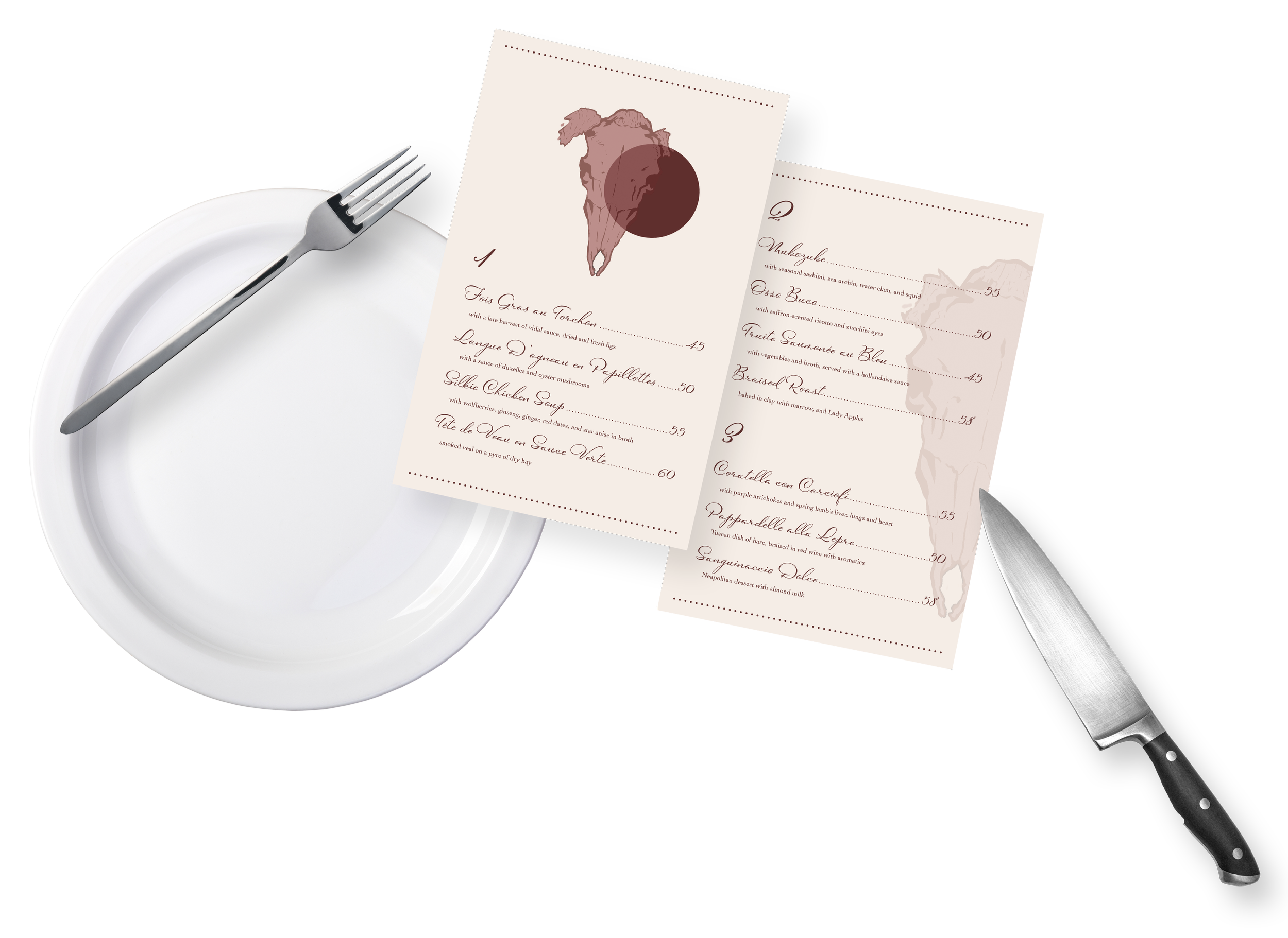
Starting as a simple book cover design project, I expanded this aesthetic into a concept: a faux restaurant. I created the menu design by using a drawing I had previously scrapped for the book cover, repurposing it into a fancy-looking yet identifiably grotesque menu.
Iteration #2
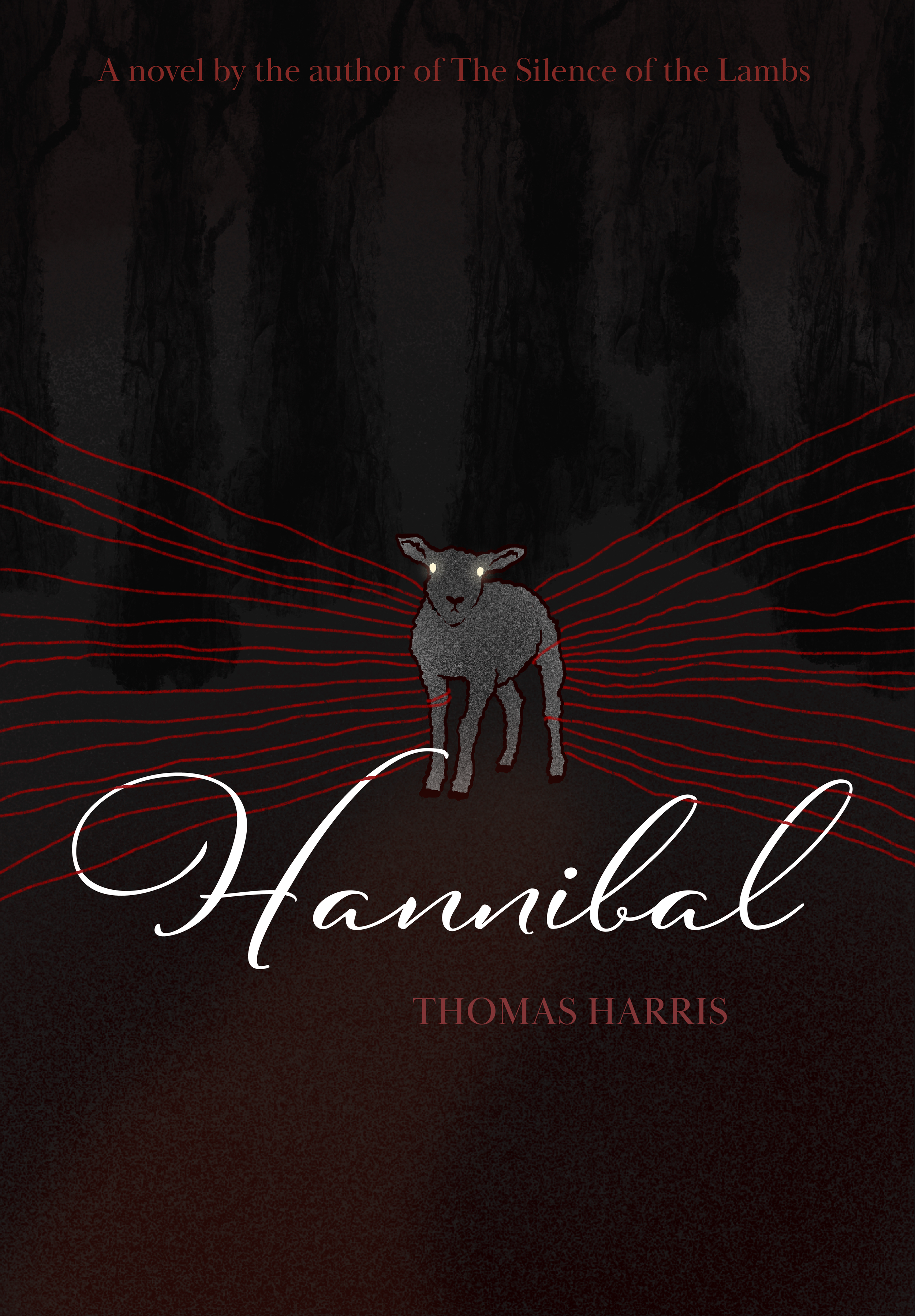
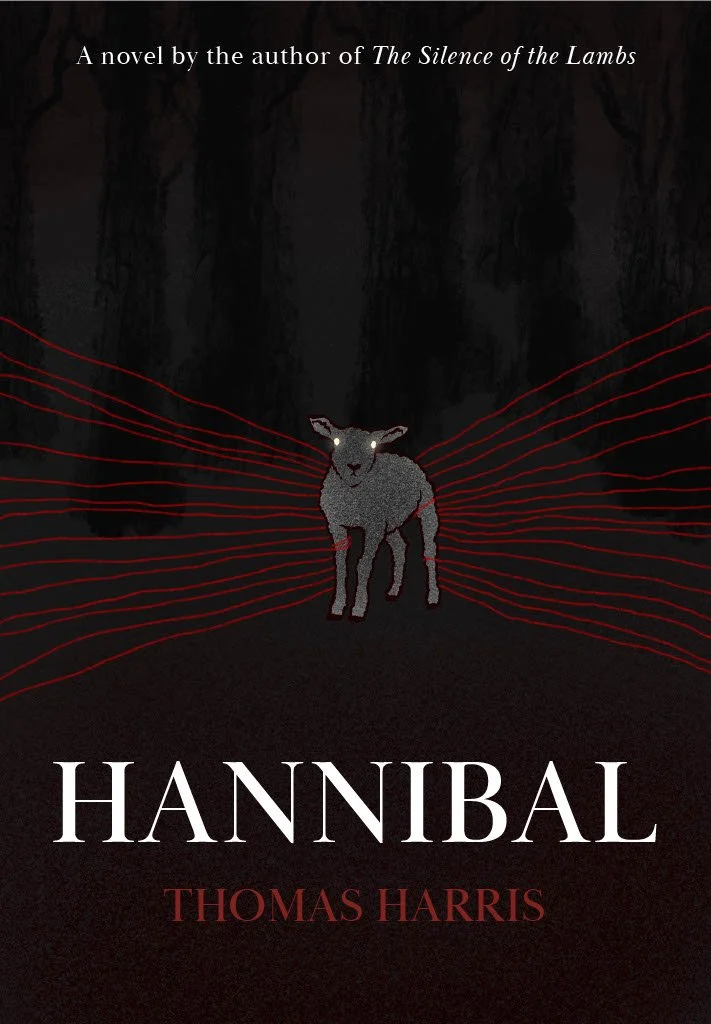
Final
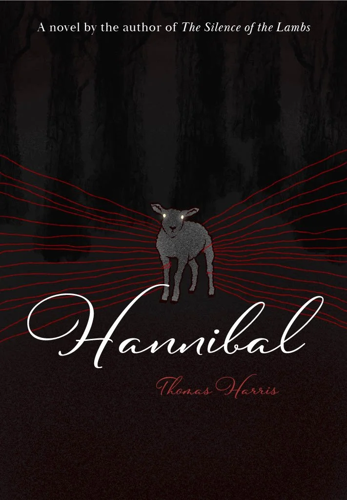
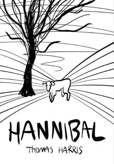
Iteration #1
Digital sketch
Student project made in Fall 2024
GDV-300-01 Projects I
-
The original book cover of the Thomas Harris novel Hannibal is not as communicative to what the book is actually about. It appeals to older audiences that likely already know the gist of what the story is about and does not work to pull in younger audiences. My goal was to make it more thought-invoking, especially to people that have seen the NBC show and want to read the novel it’s based off of.
-
I created a book cover design using digital illustration in Procreate as well as Adobe Illustrator for the layout and typography. This redesign ties in elements from the show while also being generally symbolic of a lamb being led to slaughter, with the red strings being representative of the criminal investigation against Hannibal Lecter.
The script typeface for the title combined with the serif typeface for the subheadings are indicative of the carefully crafted aesthetic that the book perpetuates.